Tuesday, April 30, 2013
Blog 5 Carilyn's Store Logo & Mission Statement
To indulge the Mother and Child experience by providing the necessary elements in order to make a fashion statement wherever they go.
Monday, April 29, 2013
Aliana's Blog 6
Lala' Boutique is focused on bringing new and stylish clothing to women from up and coming designers. We vow to helping every women embrace their beauty and show off thier unique style.

Tuesday, April 23, 2013
Sancie's Logo
“Timeless Pieces aim to be the world's leader in vintage and modern pre-loved luxury clothing and accessories. Our goal is to provide outstanding service everyday, one customer at a time.”

JPEG

Exotic Men’s Clothing is built on delivering men with the best and most unique tuxedos. We will ensure that your attire will be the only exotic look at every event you attend.”
Crystal/ Blog 5

Mission Statement
French Paws is luxurious boutique that will cater to all the needs of your little ones.We want our boutique to be a relaxing get away with a European feel for our customers. We promise to always provide you and your puppy with the best customer service and we will strive to always carry top quality clothes, accessories, and products for your puppies.We want to ensure that we build long lasting relationships with our customers and that their happiness is what we are aiming for.
Monday, April 22, 2013

Wednesday, April 17, 2013

Tuesday, April 16, 2013
Blog Post 4
How To Remove A Background on PhotoShop Cs6
1. When deleting a background the first thing that should be taken is selecting the image .
2. When the picture is selected, Right click on the picture along with photoshop Cs6.
3. Control + to zoom in to get a full view of the image .
4. Under the layer located on the bottom right side of the screen,Double click to enable the photo so that it can be modified .
5.select the picture under layer #1 or zero.
6. On the navigation tool bar go to the magic wand or the W key .
7. Right click on the left side of the picture.
8. Delete,then de-select until the photo minimized or deleted.http://m.youtube.com/watch?v=mQC2H5_fMSM&feature=related
Wednesday, April 10, 2013
Aliana Roman: Blog Post 3
The store layout is sort of like a race track. There's one main path around the produce and then the aisles on the side. The merchandise in this store is not in any way set up to cross merchandise. The space they have is limited so everything is stacked high and placed where there is space. The main idea of the store is to sell fresh produce to their customers. Since the store has only one purpose that customers shop there they don't need to do too much.


Tuesday, April 9, 2013
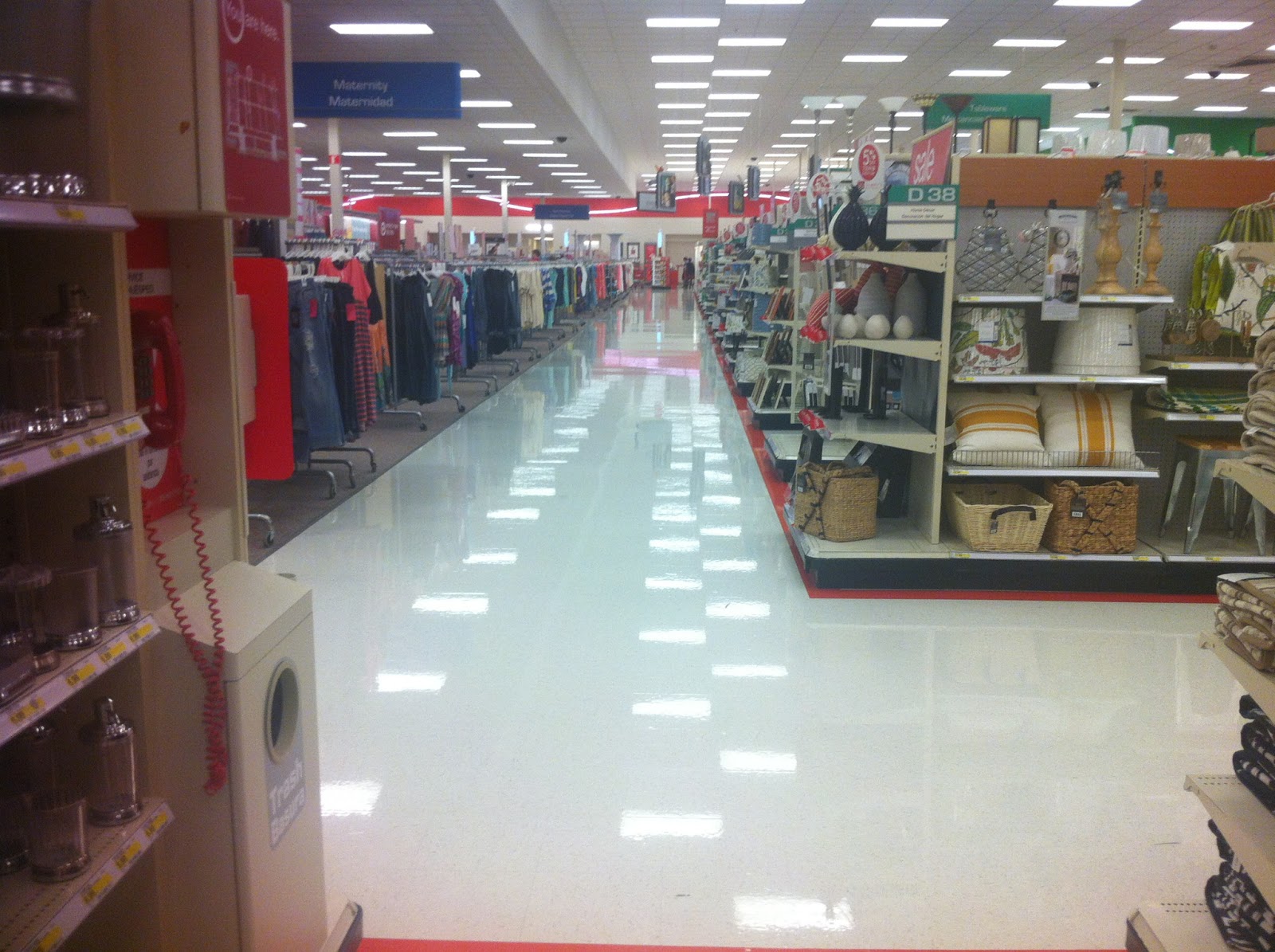
Blog post 3 Trisha
The store I visited this week was Super Target locate it on Orange Blossom Trail ( Hunters Creek). The store layout use is a combination of grid; fixtures parallel to the wall. After walking around the store what I found more interesting was the merchandise presentation in the home department. The way products were place was more in a crossmerchandising way. They purpose is to make it easier for the customer to find the complete image of what they are looking for. Here are some pictures of the beautiful in store display I saw.


.JPG)

.JPG)
Sancie: Blog Post 3
The store I decided to go to in order to complete this assignment was Publix, which everyone knows is my favorite store to go to because their customer service is superb. The type of layout that is used in Publix is a simple grid layout, which is a linear design with fixtures arranged on parallel aisles. With this layout, it allows for efficient space use, and it also helps shoppers to see and most importantly reach whatever items they're shopping for easily. It also allows the shoppers to be able to navigate throughout the store freely.
I found a couple of displays in the store that demonstrated the cross merchandising of some of their products. The items that you see photographed here are: strawberries, whipped cream, and shortcake dessert shells. By placing these items together, they're obviously selling an idea to their customers. The idea that they are trying to portray is how easy it is to make a tasty and delicious dessert.


I found a couple of displays in the store that demonstrated the cross merchandising of some of their products. The items that you see photographed here are: strawberries, whipped cream, and shortcake dessert shells. By placing these items together, they're obviously selling an idea to their customers. The idea that they are trying to portray is how easy it is to make a tasty and delicious dessert.
Blog Post 3 - Megan
I went to Winn dixie for this weeks assignment. This store uses a racetrack layout with staggered displays on either side of the group of aisles. The racetrack works really well for this store because it makes the customer feel like they have to circle the whole thing resulting in more purchases.


 And my final example is putting the trash deodorizers next to the trash bags.


I also found some examples of cross merchandising, such as the Stacys Chips next to the humus, in the first picture.

Another example of cross merchandising, putting the lighters next to the charcoal.


Carilyn Blog Post 3
Location: Publix, Landstar Blvd., south Orlando
Interior image of Publix is a general idea of the grocery store layout. The layout is the simple grid layout with the basic fixtures of gondolas.
The interior photograph of a display is one of Latin vegetables and fruits along with its condiments to compliment a dish. This example of cross merchandising/selling has the following items: avocado, green bananas, onions, garlic, coconuts, pineapples, mangoes, oranges, and at the bottom are the condiments such as "adobo" and oregano. These products in the cross merchandising display make great Latin dishes such as: "guineitos en escabeche" (pickled green bananas), fruit salads, avocado gazpacho, and many other.
Work cited for downloaded images of foods:
http://sazonboricua.com/gazpacho-puertorriqueno/
http://karma-free-cooking.com/2009/12/21/green-banana-escabeche/
Monday, April 8, 2013
Blog post 3 Pedro Diaz

In this picture you have tortilla wraps and shredded cheese put together so I believe they cross merchandised, because they want the customer to pick up a pack of cheese on there way of picking up a pack of tortilla wraps. The idea behind this is that I think the grocery store carries is that they know that most people who make some type of food with this tortilla wrap is most likely going to buy cheese as well to go with the wraps.

Walmart uses a pretty simple layout where they pretty much keep every single same product together. The customers are able to have a variety of the same product in one place and are able to grab everything they need quickly. The layout is pretty open straight to the point you can see what your looking for from a couple of aisles away.
Natalie: Blog Post 3
.JPG)
.JPG)
.JPG)
.JPG)

.JPG)
.JPG)
.JPG)
I went to Wal-Mart. The one by Metro West. In my opinion Wal-Mart utilizesa racetrack layout. Though in my opinion and as you can see in the pictures it has too many hallways. That akes me think that it also utilizes a freeform layout because of the many hallways that it holds other than those from the gondolas. I pictured the packs of water bottles at the entrance of the store as the visual display. The water is normally located at the back of the store with all the other liquids. So yes, I believe cross merchadinse is being used. Also I believe the idea is that Summer is coming, is getting hot and people want to keep hydrated, so they have a special on those packs of water bottles.
Thursday, April 4, 2013
Pedro Diaz Blog Post 2

Journey's
Unity: The merchandiser used unity because all the shoes on the display are Converse. He also showed unity because he organized the shoes by color. All of the shoes are next to colors that are similar to each other. For instance, the second to last level has different types of reds next to each other.
Harmony: Harmony was used in the display with the organization. Yet again the shoes are organized in a manner where they are consistent since they are all the same brand.
Balance: The shoes are organized in a symmetrical way because they were placed by the merchandiser in an even way. They are also angled which is how the merchandiser chose to balance their display.
Repetition: The merchandiser clearly uses repetition well because all the shoes are of the same style. There are not any other type of shoes or other style of Converse they are all lowtops and all are on the same display.
Rhythm: Rhythm is achieved in display because all the shoes are color coordinated they are also angled in an eye-catching manner that draws the attention of customers.
Emphasis: The merchandiser draws the attention of the customers by adding emphasis to the over all shoe. The color variation adds special attention to the actual shoe by drawing customers in. There are many colors therefor someone is bound to like one of them.
Contrast: The merchandiser shows constrast with the colors. Although, the shoes are all the same since they chose to use different colors of them it shows the different type of shoes you can get.
Surprise: The merchandiser uses surprise also with the contrast in colors. The colors are the suprising things of this piece and is the most attention grabbing part of it so, that is the most suprising.
Wednesday, April 3, 2013
Natalie: Blog Post 2

This visual as you can see is from A’GACI. I believe the merchandiser used unity as of the dresses. Even though they are different colors they still look good by each other. Also the lighting of it helps because it makes emphasis in the whole outfit. Harmony is used with the white colored dress, but the red shoes give the outfit balance to stand out more. The only thing that could be marked down as repetition would be the hair because even though they are different colors, they are the same length. Maybe I am wrong but I do not see any sign of rhythm other than the dresses being short. Like I said before the red shoes give emphasis to the white dress while the other mannequin the dress is the emphasis because of the different colors that it has. A contrast in the visual is that while the left dress has many different colors the right one is pure in the color white. For me a surprise was to put such a short dress like the one on the left side on the mannequin because it does not look so good but it does captures attention.
Aliana Roman Blog 2
Store: Armani Exchange
The store display was in good unity because of the lighting on the display and the fact that they stayed in the color scheme. They used very light neutrals and a touch of pastels. The harmony was very settle, since that whole section was the same theme and even moving to the next section it was still not a crazy transition. The balance was informal. This being that the tables are different levels but one table doesn't override the other smaller two. They used repetition very wisely. The whole section has the same repeated colors and you even see the sweater folded on the table also hung up on the wall. The display shows rhythm in they way the merchandise is displayed on the table. The larger items are behind and the smaller in front . Also on the wall. They show the pastels then move on the white and black. It brings out the color pastel more. The emphasis was used on the tables. they used the glass box to make the items seem exclusive and more valuable . The contrast was in the color scheme of black and white and then a soft color to stand out. Even over on the right you can see they did the same with the red. As for surprise I thing that the purses were the surprise factor as well as the glass box. They grab your eye when you walk in since they are larger.

The store display was in good unity because of the lighting on the display and the fact that they stayed in the color scheme. They used very light neutrals and a touch of pastels. The harmony was very settle, since that whole section was the same theme and even moving to the next section it was still not a crazy transition. The balance was informal. This being that the tables are different levels but one table doesn't override the other smaller two. They used repetition very wisely. The whole section has the same repeated colors and you even see the sweater folded on the table also hung up on the wall. The display shows rhythm in they way the merchandise is displayed on the table. The larger items are behind and the smaller in front . Also on the wall. They show the pastels then move on the white and black. It brings out the color pastel more. The emphasis was used on the tables. they used the glass box to make the items seem exclusive and more valuable . The contrast was in the color scheme of black and white and then a soft color to stand out. Even over on the right you can see they did the same with the red. As for surprise I thing that the purses were the surprise factor as well as the glass box. They grab your eye when you walk in since they are larger.
Tuesday, April 2, 2013
Crystal Mitchell Blog Post 2


The Store that I went to was American Eagle Outfitters in the Seminole Town Center Mall. I was actually on my way to take a picture of H&M, but when I passed this window display it caught my attention. I never shop here nor do I pay attention to the store. The colors stood out to me and the sign that said "Remix Your Style" got my attention. American Eagle applied "Unity" to their display because all of the colors, theme, and the background pictures made a balanced and a complete look. Harmony was used by the careful hand pick pictures that were used to show different styles or "remixes" of different styles and outfits. Balance was good because nothing was over done or over the top. Every aspect was evenly balanced. I was able to see everything clearly. Repetition was good. As I looked over the window displays I got the message that different styles were remixed over and over again. The rhythm was the same as well. Emphasis to me wasn't on one particular outfit. All of the outfits displayed in the window display were evenly emphasized. Contrast was beautiful. I loved the different color patterns and color contrast. The light colors with the dark colors. Also were patterns mixed in their as well. Surprise to me was the fact that this store caught my eye and made me stop. I NEVER even notice this store. There was no particular item or outfit that stood out or surprised me. What surprised me was the store itself. The store always was boring to me and dull and easy to walk pass without even noticing it. To see it alive and full of colors made me almost want to go in the store. It made me notice it and stop. Which is what a window display is supposed to do. It's suppose to spark an interest or curiosity enough so that a person would come inside the store. American Eagle Outfitters did an awesome display.
Sancie's Blog Post 2 (Principles of Design)
As I was walking thru the mall, I had no idea as to what store's window display I wanted to capture in order to complete my homework. So I decided to just walk until something caught my eye. The window display that I decided to use was the one from Caché. The reason why I chose this one was because I felt as though it was simple, yet it displayed all the principles of design.
In my opinion, the window display as a whole and the way the merchandise was presented was in unity. The colors used were complimenting to each other, that is how harmony plays a role. On each side of the windows, the merchandises used for display were equally balanced on both sides, thus creating a unified presentation, also known as formal balance. The merchandiser achieved repetition by the colors that were used, which created rhythm. Emphasis was used to show the contrasting colors and how well they completed each other. To show contrast the lighter colored merchandises are being displayed along with the darker items. I don't think the final principle, surprise was demonstrated in this particular window display.


In my opinion, the window display as a whole and the way the merchandise was presented was in unity. The colors used were complimenting to each other, that is how harmony plays a role. On each side of the windows, the merchandises used for display were equally balanced on both sides, thus creating a unified presentation, also known as formal balance. The merchandiser achieved repetition by the colors that were used, which created rhythm. Emphasis was used to show the contrasting colors and how well they completed each other. To show contrast the lighter colored merchandises are being displayed along with the darker items. I don't think the final principle, surprise was demonstrated in this particular window display.
Trisha Principles of Design
Store: Stradivarius
Unity- The merchandise use in this window is more of a combination of neon colors and neutral. The colors define the purpose of the window.
Harmony- The accessories of the window background match completely with the message of the window and the outfits creating the perfect scene of traveling.
Balance- the balance on this display is perfectly coordinate, with a combination of bright colors and adding neutral color to make it more attractive to the eyes.
Repetition- the repetition on this window display is the use of the same maniquins, different poses, same hair, same color combination on the three outfits.
Rhythm - it is easy to tell that three manniquins are not place with the same pose but the color make it keep the same rhythm on the display.
Emphasis- This display show three different outfit a stradivarius girl would wear to travel down the fashion avenue and center town. it gives the element need it for the trip to make it easier for the consumer to imagine themselves traveling down the fashion avenue.
Contrast- the way they use luggage and a map make a fabulous contrast with the outfits and images to create the perfect scene of traveling.
Surprise- the surprise on this display is the use of luggage to hold the accesories necessaries for the traveling. Also the map on the wall and the ballons give the image of being free traveler.
The letters on the window are also a surprise for the display. The manniquins expressions and the images are enough to tell the meaning of the store but signage was use to make it easier to get the message.
Also to complete the window display a least of prices of the items used is display next to the manniquin as a complement of the window.
I pick this window from a mall on my trip to the Dominican Republic last week. Window display over there are more complete and have more meaning comparing to the ones I see here. This store is European style which complete explain why there is so much creativity on only one window.
.JPG)
Andrea Craig Blog Post 2 Principles of Design
The store I chose was Rue 21 (West Colonial)
Unity- The visual merchandiser used mostly neutrals with some monochromatic colors (pink) to give the window a spring feeling. The shoes and accessories on the mannequin blend well with the color scheme.
Harmony - The picture in the background and the signage match the message the window display gave.
Balance - Although the display window had an informal balance . The mannequins were align and the windows weren't cluttered with merchandise, The visual merchandiser could've done a better job with the neatness off the shoes on the mannequin.
Repetition- When analyzing this display it is clear that the merchandiser uses a variety of pink's and blue's (denim) against a neutral color.
Rhythm- When looking at this picture it gives you the illusion of girls posing as if they were taking a picture . The mannequin and the picture in the background look like they are all in unity with one another.
Emphasis- The emphasis in this visual display is on the bold signage At the bottom of the window.The merchandiser is clear of the projected target market which is thespring breakers .
Surprise - The most surprising part of the window display was how the merchandiser used a metal pole as a tee shirt holder. It was diffrent and implement another tool other than the basic mannequins and holders
Contrast- This display used some contrasting colors .
Subscribe to:
Posts (Atom)