Tuesday, August 28, 2012
Tuesday, August 21, 2012
Blog Post 4
Edward Scissorhands/Alice in Wonderland Chocolate Forrest

The garden from Edward Scissorhands is a dark, romantic concept that I feel would resonate beautifully as a chocolate forest. I like the idea of using models/mannequins who will have the animals on a leash. I would like to build a castle and have texture on it to make it look like chocolate moss as well as large chocolate rose bushes.

This picture shows more of the castle and the brick road as I would like to incorporate it in my design. The gothic style is more of what I am aiming for with my design. I like the idea of building animal bushes out of chocolate or Reese's Pieces wrappers for added texture.

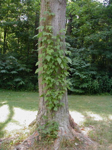
what I like about this picture are the large, lush flowers that create interest in the forest. Secondly, the gate in the background could be used with the castle, or in lieu of the castle. The different types of plants would be Incorporated as well.
Krizia Rivera
Blog Post 3

This is a picture of the entrance and fruit section of Walmart. As we know, Walmart incorporates a racetrack layout so the shopper usually needs to make round around the whole store in order to get all their items. you can notice the cash register is right by the entrance which is to ensure that the customers must pass various sections and maybe the same section twice to make it back to the registers.

In these pictures they seem to have a focus on fruits, but in the background you notice complimentary products such as dressings, tofu, cheeses, and breads that they place nearby. they also place pictures of food above the aisle in order to guise the customer and it makes the fruit look more appealing. the story they are trying to tell seems to be the organized layout, the freshness of the fruit, and the low prices.
Krizia Rivera
Leighton Sprayberry: Tim Burton Forest


Tim Burton Forest
The idea behind my chocolate forest lies in both the
history of chocolate and in the magic of movies. In the fourteenth century, the
Spanish conquistadors brought the seeds back home to Spain, where new recipes
were created. Since then, new technologies and innovations have changed the
texture and taste of chocolate, but it still remains one of the world’s
favorite flavors.
The forest I envision is a Tim Burton-esque inspired
forest of snow-covered, Spanish silver birch trees. Tim Burton is a film director
known for his quirky, dark-themed movies such as such as Charlie and the Chocolate Factory, Edward
Scissorhands, and The Nightmare Before Christmas. In
all of his movies, there is an element of magic in them, and it is my desire to
convey a sense of that magic in my display idea. For instance, in Tim Burton’s
The Nightmare Before Christmas, one of the main sets is a dark, ominous looking
forest that the main character walks through and accidently lands into another
world.
The evenly spaced trees, swirled patterns in the ground,
and the overall dark atmosphere is influenced by this mystic forest in The
Nightmare Before Christmas while the actual birch trees are influenced by a realistic
birch forest in Spain. These elements also contrast with its start winter
atmosphere to bring a quirky attitude to the display. The swirled ground and
the tree elements can consist of molded dark, white, and milk chocolate while
the frost on the ground and snow on the trees can be accomplished using powdered
sugar.
Brittany Roeper
Chocolate Forest Inspiration


Monday, August 20, 2012
post 4
brittani williams
A Forest Gift

This first image would be the center of my entire presentation:three large "present" boxes of different sizes. This helps to represent how I and I'm sure many people felt when they were younger and given chocolate. I wasn't something you got just because you wanted it but because you did something good and deserved it, a present.

I drew inspiration from this image by having the present boxes wrapped in a variety of chocolate wrappers. This will help to remind people of the many varies chocolate comes in and may even feature some they've never heard. Also because plenty if not all chocolate wrappers have a shine to them it will help to add to the present theme.
 This finally image is what reminds people that this scene takes place in a forest. The green ivy seen in this picture would be wrapped and seen coming out of the presents as if the presents are apart of nature. Or like the chocolate presents have just been waiting for the right gifted person to come along.
A Forest Gift
This first image would be the center of my entire presentation:three large "present" boxes of different sizes. This helps to represent how I and I'm sure many people felt when they were younger and given chocolate. I wasn't something you got just because you wanted it but because you did something good and deserved it, a present.
I drew inspiration from this image by having the present boxes wrapped in a variety of chocolate wrappers. This will help to remind people of the many varies chocolate comes in and may even feature some they've never heard. Also because plenty if not all chocolate wrappers have a shine to them it will help to add to the present theme.
Friday, August 17, 2012
Blog Post 4
Shanay C.
RMMT120
8/17/2012
Blog Post 4


RMMT120
8/17/2012
Blog Post 4

The first picture for inspiration for the chocolate forest, I have the idea of everything (trees, oath, sky, etc) being represented by clothes. For this idea I would like to see different verions of chocolate used as well. For the trees, there would be models covered in chocolate as well.

For my second idea, I would like to see a chocolate version of the childhood story of Little Red Riding Hood. Little Red Riding Hood's basket will be filled with chocolate, the path that she walks to get to grandma's house would be chocolate and the grass would be as well. Grandma's house could be made of all chocolate as well. The trees would be in chocolate form. The flowers and mushrooms would be colored to show variety.Everything would basically be in chocolate and colored in to reflect the above picture.

And finally, for the last picture instead of everything representing an actual forest filled with trees, everything would be shoes. A chocolate shoe tree, chocolate shoe house and so on. Like this picture displays above, there would be various styles of shoes in all sorts of colors.
Tuesday, August 14, 2012
Post 3


Brittani WilliamsThis layout and visual display comes from Winn Dixie. This specific grocery store is using a combination floor layout, consisting of soft aisles and racetrack. In the center of the store there are the regualr lined aisles and on the outside of these aisles are soft aisles that help to give Winn Dixie a market place feel. In the visual display(bottom picture) Winn Dixie crossed merchandised; including pickles, baked beans, spare ribs and a party tray(crackers,ham,cheese,turkey). With all these items being used in one display Winnie Dixie is trying to convey the idea of a family summer barbecue.
Brittany Roeper
Blog Post 3


Blog Post 3


Downtown Produce which is located in Melbourne, Florida is a specialty grocery and produce market. The store is layed out with a soft isle approach. Several free form dispalys add to the overall alyout as well. Ample space to move from item to item gives an open non congested feel. The picture directly above shows an example of one of the displays featured in at Downtown Produce that demonstrates cross merchandising. With the base of the display housing the main item: cheeses, the very top has an array of crackers as well as several bottles of wine. This display is great because both crackers and wine are often paired with cheese, allowing the customer to take advantge of the whole dispaly, getting more than one item in one location.
Monday, August 13, 2012
Blog Post 3
Shanay C.
Rmmt120
8/13/2012
Blog Post 3


Over
the weekend I took a quick trip to The Neighborhood Walmart Grocery
Store to pick up a few things. With the first picture, Walmart's layout
is a racetrack layout. With grocery stores such as this one, there are not many
changes that take place and the layout stays standard at all times which allows customers to
find what they need and know where to get it without having to guess
where everything is located. With
the second picture, the visual display I selected was of coffee
grounds, creamer and on the right side of the display were coffee
filters. Walmart chose to cross merchandise with the above listed
products because in order to make coffee you need all three items to
successfully make coffee.
Tuesday, August 7, 2012
Blog #2
.jpg)


brittani williams:

This window display is from H&M in the Florida Mall. In
this window there are four children scattered throughout the display. To begin
I feel as if this window display is very much harmonies especially in keeping the stores brand image,
its clean and very on trend. With the
harmony of window display being fulfilled there is clearly a sense of unity
with the entire display. I would have to say that this side of the window is
balanced but informally. Even though the male mannequin on the left alone is
taller than the one on the right, the right boy mannequin is placed on boxes,
which makes him appear tall to even them out. The principles repetition and
rhythm are noticeable in the placement if the mannequins up and down, one in
each “row”. The placement of these mannequins continues to draw the viewer eye
up and down. Besides the four mannequins alone emphasis is also put on the hats
and bag in the display by them being place in wood boxes, almost like a mini
frame. The main form on contrast in this display is the obvious colors used
against a white background. For me the one element that came as a surprise and
that drew me to the display was the female mannequin in the upper left corner.
While the other four are standing she is sitting in a very human position that
people don’t expect to see when looking at a mannequin.
Blog Post 2

Christina Glore
Visual Merchandising
7 Aug 2012
Blog Post 2
I
took this picture at an American Eagle Outfitters store. It is a display they
had near the entrance of their store.
This display shows unity and balance because the mannequins displayed are
A-symmetrical and pleasing to the eye. The display is shown as a whole. The
display shows harmony with the striped shirts. They are well laid on the glass
table and as well on the mannequin. The repetition is shown in the coral color
starting in the pants of the middle mannequin and continuing on the scarf of
the right side mannequin, in the shoes in the middle of the display and finally
on the striped shirt on the bottom left. Repetition is also shown with the
strips through the whole display, with the shirts lying on the table and on the
left mannequin.
Rhythm
is displayed with the placement of the mannequins they are well balanced with
one in the middle being taller than the others than leading your eye back down
to the other two mannequins. The emphasis is placed on the mannequin in the
middle. The colors on that mannequin are brighter and draws your eye to those
items first. The contrast is placed on the mannequin in the middle with the
bright color of the shirt and pants than the dark jacket placed on top of that.
As well as the right mannequin with the printed skirt with the basic white tank
paired with it. There is also contrast on the bottom glass table with the
striped shirts placed along side of the flowered printed skirt.

This picture is an example of an in-store display from Target. There are many principals of design at work in this display including balance, repetition, rhythm, unity and harmony. Balance is seen through the use of side by side combinations, as well as mix and match pieces paired next to one another. Repetition of colors causes the eye to transition seamlessly across the display allowing for cohesion of the products. By setting all tops on the upper half of the display, grouping all bottoms underneath the display, it has a rhythmic quality. Because this visual display allows the customer to thoroughly understand and maneuver the product line well, with color cohesion, and display understanding, it overall has unity which works very well.
Shanay C.
8/7/2012
RMMT120
Blog Post 2
8/7/2012
RMMT120
Blog Post 2
 |
| Men and women's display at H&M, Crabtree Mall in Raleigh, NC. |
The photo is of an H&M window display at the Crabtree Mall in
Raleigh, NC. I visited the mall this past weekend and got to knock two birds
out with one stone: shop& work on the blog post for this class. =)
The top portion of the window display is the women’s items and the
bottom is of the men’s portions which are both displaying some of the new
fashion that is offered in the store for $9.95. With this display, the
merchandiser used the Principles of Display with Unity by using fall colors for
the men’s and women’s display. With both displays, there is a base color that
is used (red or yellow) to make both windows unified as a result, this creates
harmonious unity elements. The women’s window creates balance because although
there are 4 women on the right side and one on the other with a shelf…the view
is quite balanced and same for the men’s display as well. There isn’t much
repetition but there is much rhythm with both window displays. From what I can
see, the merchandiser used much emphasis on the colors red and yellow. Contrast
is seen with the men’s displaying other male models in the backdrop and the
women’s display not. It gives the effect that there are more male models in the
window display when there are not; it’s very busy. I would say that again, with
the male display having more that is appealing to the eye; their visual is very
surprising because the women’s display is very minimal.
Subscribe to:
Posts (Atom)