Wednesday, January 30, 2013

Elisa blog post 4
This week we were asked to find a tool in photoshop that we have yet to use in class. Honestly, with so many tools to choose from, this wasn't an easy decision. After some research I was able to find a tool that we have not used in class and basic enough for me to demonstrate, because Lord only knows we would be here all day. :-)
I stumbled upon the "blur tool" on you tube at http://m.youtube.com/watch?v=XDDlc0byWNU.
This tool is used to make parts of a photo blurry to draw emphasis on a specific focal point or even
give the feeling of motion.
Work Cited
This tool is used to make parts of a photo blurry to draw emphasis on a specific focal point or even
give the feeling of motion.
Work Cited
"Photoshop tutorial 14 blur." You tube. N.p., n.d. Web. 28 Jan. 2013. <http://m.youtube.com/watch?v=XDDlc0byWNU>.
Tuesday, January 29, 2013
Eva Blog Post 4

Hello Everyone!!
After trying to find so many ideas to share with you, I finally came across this good technique that will save everyone lots of time and effort. We all know that Photoshop can be tricky, so it would be nice if we can sort of "customize" it to our preferences. It could save us headaches and possible adult temper tantrums hehe. I hope you enjoy!
Best wishes!
Eva
WORK CITED
https://www.youtube.com/watch?v=BUmnbB5iPtY
http://www.question-defense.com/wp-content/uploads/2009/06/photoshop-keyboard-shortcuts-conf.gif
Monday, January 28, 2013
Alexandra's Blog Post 4
Alexandra Corbin
RRMT120
Blog Post 4
January 28, 2013
Blog Post 4:
This assignment required researching a tool that is used in the Adobe Photoshop program, but has not yet been covered in class. The tool that I found is the healing brush. I have always noticed it, but never had to use it, or had its use explained to me. While researching this tool, I found that it is great for reducing the visibility of wrinkles, lines, etc. it acts as a patching tool to cover these unwanted issues in photographs. There are a few steps that include highlighting the area, selecting the desired color, and lowering the opacity of the unwanted line and/or wrinkle. The link below teaches how to use this tool from start to finish; which I found on YouTube. http://www.youtube.com/watch?v=DAnims63G7w

Works Cited:
"Healing Brushes, Patch Tool Tricks: Photoshop Retouching." YouTube. YouTube, 19 June 2007. Web. 27 Jan. 2013.
"Reducing Wrinkles With The Healing Brush In Photoshop." Reducing Wrinkles With The Healing Brush In Photoshop Comments. N.p., n.d. Web. 27 Jan. 2013.
Vector Rays By Will Vargas and Designtuts
Good Morning Guys! Hope you had a great weekend, here is a cool video teaching you how to make RAYS!


After this is done lets add some texture! this I love to do, it's fun and it adds more interest!
Copy paste texture image into a new layer then (Image > Adjustments > Desaturate > Overlay)
Inportant Key Strokes for Rays:
(Control > Alt > Shift > Letter T)
Wednesday, January 23, 2013
Elisa Edwards Grocery Store Layout


Eva blog post 3
So in this week's post I visited Walmart and you should be proud because I went during the day!


 They have a race track layout which means the customers are guided through the four walls of the store with pathways and merchandise in all four corners and the middle.
  Here they crossed merchandised pie crusts, baking supplies, flour, evaporated milk etc. Everything someone would need for baking something nice for Valentine's Day that is right around the corner.
They merchandised the front of the grocery section for the superbowl.
 They have a race track layout which means the customers are guided through the four walls of the store with pathways and merchandise in all four corners and the middle. Here they crossed merchandised pie crusts, baking supplies, flour, evaporated milk etc. Everything someone would need for baking something nice for Valentine's Day that is right around the corner.
 Tuesday, January 22, 2013
Melanie Blog post 3
Visual Store Layout
Hello everyone we meet again, today I am uploading some photos of Wal-mart and their visual layout.
Walking into a Wal-mart store you can identify the layout as a RACE TRACK LAYOUT. As you see in the first picture. In the clothing department I notice the type of fixtures that they use which are, tables for graphic tees, H-frames for hang garments and straight face out for their end caps. The third photo is of their grocery aisle that shows the gondola fixtures. and the last photo will display their visual display for the Super Bowl. In this display you will see cross merchandising with Doritos, beer, water, and soda. Everything you need to get your Super Bowl tail gating party on. Now that you know about Wal-mart store layout and fixtures take a look for yourself and tell me what else you see.
Until next time have a good visual merchandise experience.
Don't forget to comment.

Don't forget to comment.


Shantel Johnson Post 3
Shantel Johnson
Ms Chelsea McCown
RMMT120
Blog Post 3
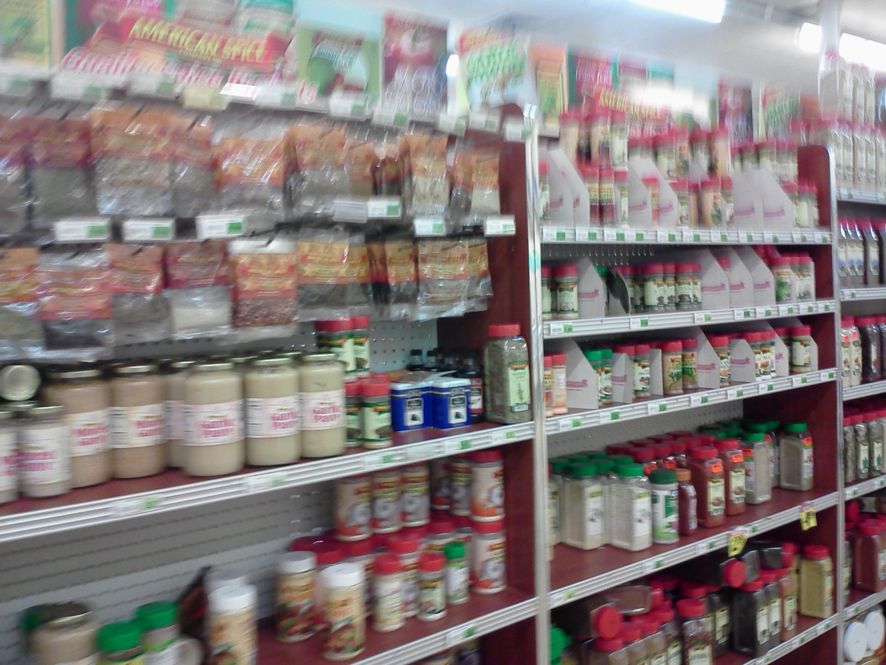
Grocery Store: Caribbean Market (located on Colonial)
Layout Used: Grid Layout with Gondola Fixtures and Library style fixtures
Caribbean Market is known for fresh cut to order meat of all sorts. The photos show cross
merchandising with the meat and directly across is seasons and herbs of all kinds for the customer.


Ms Chelsea McCown
RMMT120
Blog Post 3
Grocery Store: Caribbean Market (located on Colonial)
Layout Used: Grid Layout with Gondola Fixtures and Library style fixtures
Caribbean Market is known for fresh cut to order meat of all sorts. The photos show cross
merchandising with the meat and directly across is seasons and herbs of all kinds for the customer.


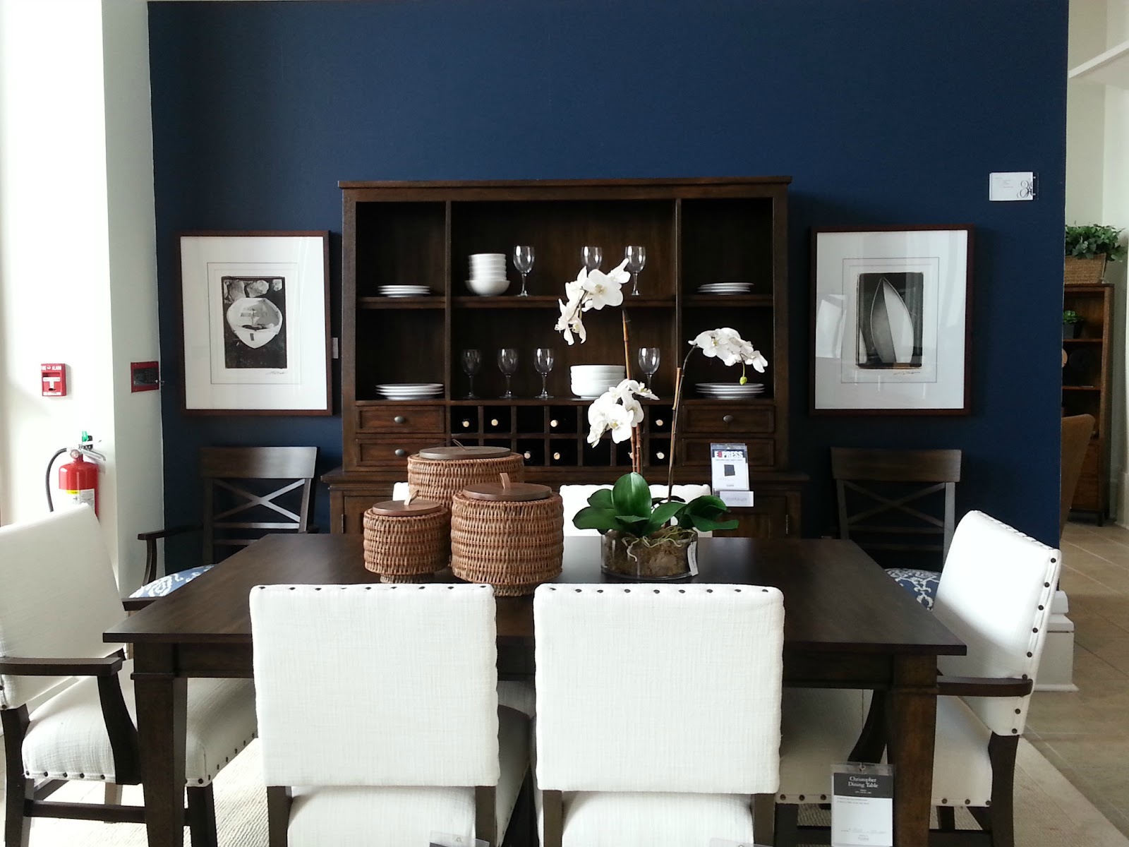
Will Vargas: Blog Post 3
As I visited the racetrack layout store, Walmart, I came across great visuals only seen during this season. As we all know 2 great holidays are right around the corner. Valentines day and the super ball are events where people highlight the occasions with great parties and cool favors. As I entered the super enter located between Hoffner and goldenrod I came across my first visual the great super beer wall you guys see in this post. This wall has the words NFL written in Budweiser boxes and includes a great looking goal and countdown for the super ball. Within this display we can definitely see cross merchandising. products like pepsi, Budweiser, and Doritos being used to create this visual display. In addition, we could also see other displays and promotions for the most beautiful day to stay home and sleep, "valentines day," just kidding! We could see the pops of pink and the tsunami of candy covering the gondolas of this super center and being promoted in all the corners of this store. Lastly, I also took a picture of another Valentines display for you to enjoy! Bye guys! Will out.


Tuesday, January 15, 2013
Blog Post 2 Vanity
Blog Post 2
1.
Unity- The unity in the wall display comes from
the blazers, even though they are different colors they are the same style of
blazer.
2.
Harmony- The harmony element comes in from the
walls are divided up they still flow nicely by the colors and having the
blazers in every spot the eye will go.
3.
Balance- The balance in the soffit is
asymmetrical with the shoes on the display and the sunglass rack on the other
side creating that off balance look which makes it much more interesting to
look at.
4.
Repetition- The repetition aspect comes from the
shelf of repeating black heels and the blazers in the opposite soffit with the
mannequin all lined up
5.
Rhythm- Couldn’t identify the rhythm
6.
Emphasis- The emphasis would be on the blazers
as they are the end use being displayed on the wall
7.
Contrast- The contrast could be the contrasting
colors of the blazers.
8.
Surprise- Couldn’t identify surprise
Eva Blog 2
.JPG)
For
this post I chose to window display that I did myself working for Nautica. In
making this window a success we needed to apply the Principles of Design to the
display.
Starting
with Unity…
There was a sense of unity when it came
to the color story of the outfits. They all seemed to be able to combine with
each other in a way that trendy for the new Spring Collection.
Harmony
Harmony is expressed through out the
whole display. Each individual outfit has the same color story as another. In a
artful way, they tend to feed off each other. Something that you like to see in
one outfit you can see in another.
Balance
It is important to create equality to
make a unified presentation. This particular display has 2 women, 2 men, and
two kids with one sale banner. Even though they are not in a straight line or
something along those lines the mannequins are still able to give an even
amount of optical weight.
Repetition/Rhythm
Repetition
and Rhythm go hand and hand. When a
customer looks at a display it is a good idea for the merchandiser to reinforce
the displays message throughout the presentation. This display repeats the same
colors, stripes, and solid colors in dresses, pants, and men’s wear. Repetition
and rhythm creates a visual pattern that allows the viewer to follow.
Emphasis
I
think the display just gives off the repetition of colors meaning that new
spring colors are here. With the holidays just passing by us so fast with warm
colors, I think that the bright and bold colors are the main focus right now.
Contrast
I
don’t believe contrast was much of an addition to this display.
Surprise
I
would like to say the surprise in this display is the huge banner that is right
next to the display that completes the presentation. Customers are there to
shop, they want to know what you have and how much? Placing a sign with a
presentation completes the display because it engages the customer. The main
focus for a window display is to invite the customer in. If they see a sign
with large percent savings they are become eager to walk in the store. Especially
if they are surprised to see 60% off J
I hope you all enjoyed this blog, I do
not own anything but the labor that went into making the displays. Everything
else is credit to Nautica. Hope to see everyone in class tomorrow!
Shantel's Blog Post 2

Hello all,
This visual storefront
is from Louis Vuitton <3. I feel in love with it! The merchandiser used some
of the principles of design.
Unity:
There is one-ness between the actual merchandise and the props because it all
comes together as one visually. The mannequins has a leotard on and they are
balancing on a rope in somewhat of a circus theme.
Harmony:
This visual is artful and creative but still maintain the stores image of sophistication.
Balance: The use of two
mannequins gives the visual formal balance and the back drop adds chemistry to
the whole ordeal.
Rhythm:
The curve in the rope gives a sense of visual movement; as the same if they
were actually at a circus.
Emphasis
and contrast: The choice of a black leotard gives
light to the actual merchandise. This way the focus is actually the totes.
Yours Truly,
Shantel Johnson
Melanie Blog Post 2
Hello Everyone!!!!
Today I am going to display some photos on Principles of Design.
Here you will learn and see examples of all the elements of retail Design Principles.
Hope you enjoy....
This first photo was taking at the "Ethan Allen" show room.
All the elements in this floor display are combined to make the perfect balance of colors and shapes which makes it harmonious and complete .
This is the Principles of Design UNITY and could also be BALANCE.
Dinner is served

This lovely Window display is the display for "Tumi."
Here you can find the artful element that is creating the visual unity on many levels.
As you can see the unity starts with the suitcases that has the art of flowers, along with the HUGE flowers that are also displayed and in the back just when your about the walk away you get a glimpse of the flower art decor on TV.
This brings HARMONY

Another look at HARMONY.
This artful window display is shown at "The Children's Place".
Hey lets play..

Here you see the display of "Bringhton Collections".
The display is showing the equality of optical weight with handbags. Each side of the cubicles has either handbags or something to balance off the other side this is important because it creates a unified presentation.
This is called BALANCE.

O' I know your getting hungry.
This well put together shelve display can be found at your local "Publix".
Here you see the recurring design with the Cape Cod brand Potato Chips that shows the same size, color, and shape. This creates a sense of visual rhythm.
Principle of Design REPETITION

Here is another look at what REPETITION looks like in a retail store.
This Sales display with the sales zombies mannequins can be found at "Zara".

Now this is what you call RHYTHM.
Here at "Everything but Water" you can see the repetition of design that creates the unique sense of visual cadence and emphasis. Its all in the color, the cubes, and the hanging of the garments.

Look at this amazing window display
"Louis Vuitton" is going big on the EMPHASIS
The contrast of the gold flowers behind the bright colored handbags highlights the entire presentation.
But wait they are not the only one's Check out

"Victoria's Secret" EMPHASIS on their sexy eye catching display.
They surely achieved their goal with those big wings on the back of that mannequin, you have no choice but to look at what they have.

Well if your a Hello Kitty fan there is a store just for you at "Sanrio Smiles".
Their window display speaks CONTRAST.
Here you see extreme taking to the next level with HUGE Hello Kitty teddy bears shown with mini items of Hello Kitty.
Talk about going crazy for Hello Kitty.

SURPRISE...
The Dr. is ready to see you.
This window display at "Kiehl's" screams HELLO, its eye catching skeleton dressed in a Dr. scrubs makes you do a double take.
Now that you have learned all the elements of Principles of Design.
Add your comment on which one of the Design Principles is your favorite and why.
Hope to hear from you until next time see ya. -Mel
Disclaimer
None of these displays were done by me and I do not take credit for any of the window displays, shoe cases, or in store shelve displays as my own nor will I be using any of what's shown here for personal use. All photo's are being used as an example of retail design principles.
*********ALL PHOTOS WERE TAKEN AT MILLENIA MALL AREA STORES. **********


Subscribe to:
Posts (Atom)