Hello Everyone!!!!
Today I am going to display some photos on Principles of Design.
Here you will learn and see examples of all the elements of retail Design Principles.
Hope you enjoy....
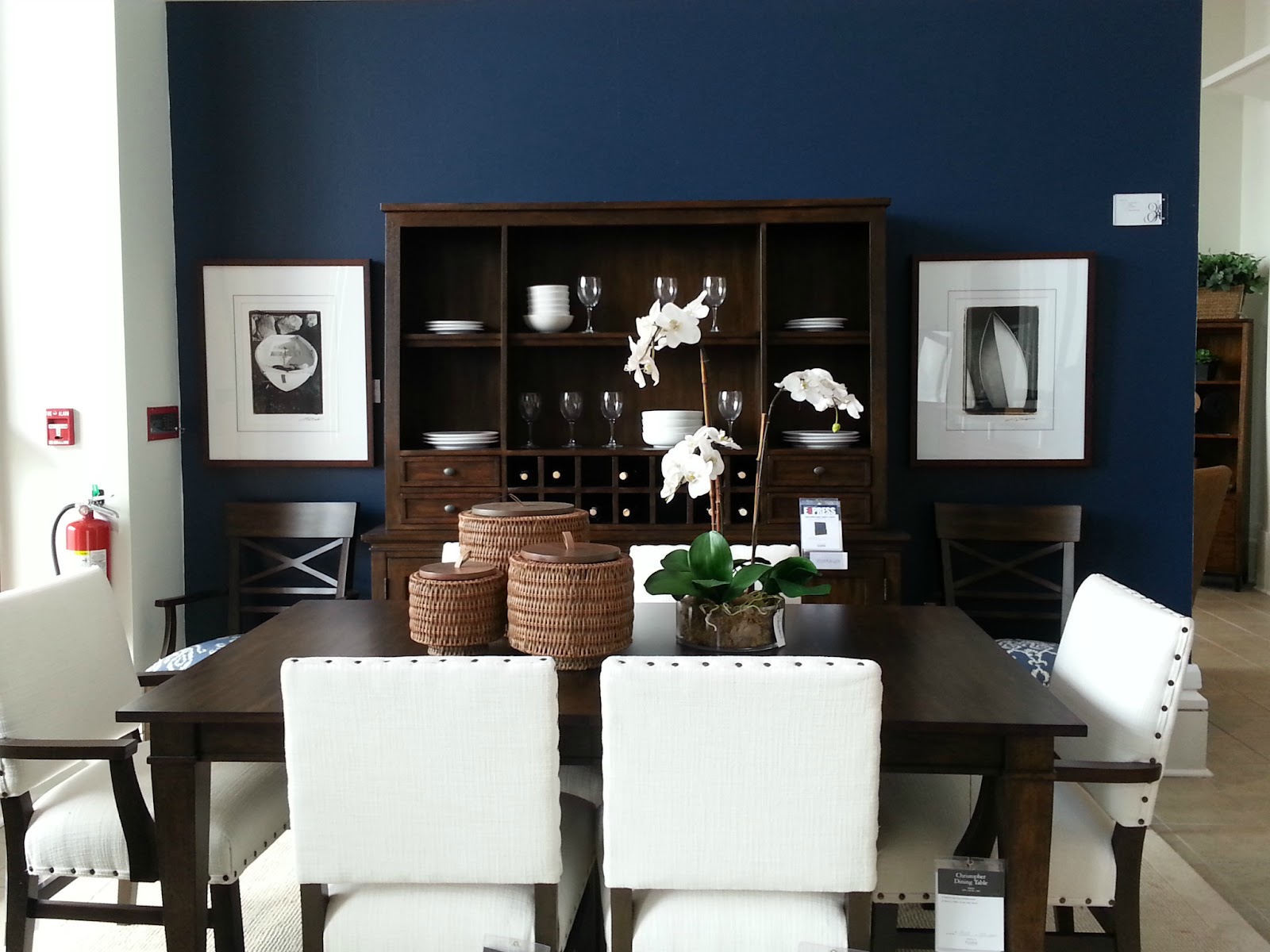
This first photo was taking at the "Ethan Allen" show room.
All the elements in this floor display are combined to make the perfect balance of colors and shapes which makes it harmonious and complete .
This is the Principles of Design UNITY and could also be BALANCE.
Dinner is served

This lovely Window display is the display for "Tumi."
Here you can find the artful element that is creating the visual unity on many levels.
As you can see the unity starts with the suitcases that has the art of flowers, along with the HUGE flowers that are also displayed and in the back just when your about the walk away you get a glimpse of the flower art decor on TV.
This brings HARMONY

Another look at HARMONY.
This artful window display is shown at "The Children's Place".
Hey lets play..

Here you see the display of "Bringhton Collections".
The display is showing the equality of optical weight with handbags. Each side of the cubicles has either handbags or something to balance off the other side this is important because it creates a unified presentation.
This is called BALANCE.

O' I know your getting hungry.
This well put together shelve display can be found at your local "Publix".
Here you see the recurring design with the Cape Cod brand Potato Chips that shows the same size, color, and shape. This creates a sense of visual rhythm.
Principle of Design REPETITION

Here is another look at what REPETITION looks like in a retail store.
This Sales display with the sales zombies mannequins can be found at "Zara".

Now this is what you call RHYTHM.
Here at "Everything but Water" you can see the repetition of design that creates the unique sense of visual cadence and emphasis. Its all in the color, the cubes, and the hanging of the garments.

Look at this amazing window display
"Louis Vuitton" is going big on the EMPHASIS
The contrast of the gold flowers behind the bright colored handbags highlights the entire presentation.
But wait they are not the only one's Check out

"Victoria's Secret" EMPHASIS on their sexy eye catching display.
They surely achieved their goal with those big wings on the back of that mannequin, you have no choice but to look at what they have.

Well if your a Hello Kitty fan there is a store just for you at "Sanrio Smiles".
Their window display speaks CONTRAST.
Here you see extreme taking to the next level with HUGE Hello Kitty teddy bears shown with mini items of Hello Kitty.
Talk about going crazy for Hello Kitty.

SURPRISE...
The Dr. is ready to see you.
This window display at "Kiehl's" screams HELLO, its eye catching skeleton dressed in a Dr. scrubs makes you do a double take.
Now that you have learned all the elements of Principles of Design.
Add your comment on which one of the Design Principles is your favorite and why.
Hope to hear from you until next time see ya. -Mel
Disclaimer
None of these displays were done by me and I do not take credit for any of the window displays, shoe cases, or in store shelve displays as my own nor will I be using any of what's shown here for personal use. All photo's are being used as an example of retail design principles.
*********ALL PHOTOS WERE TAKEN AT MILLENIA MALL AREA STORES. **********
No comments:
Post a Comment